Learning to See Like a Designer: A Cloud Architect's Redesign of Lawn.Smart
I'll be upfront about something: design is not my strongest suit.
My background sits squarely in cloud architecture and web application development. I've spent most of my career thinking about systems design, platform optimization, and how to structure teams and workflows that scale. The creative problem-solving I'm drawn to tends to live in the infrastructure layer — how do services talk to each other, where does logic live, how do you build something that doesn't fall apart under pressure. That's where I feel at home.
UI design? That's a different conversation entirely.
Don't get me wrong — I know my way around CSS. I've worked with frameworks like Tailwind and can hold my own when it comes to wiring up a layout. But I'm not a UI expert, and I'm certainly not an artist. My father, on the other hand, is exactly that. He spent a long and distinguished career as a custom tailor — a craft that demands equal parts technical precision and genuine artistic flair. That combination of creativity and craftsmanship is something I've always admired from a respectful distance. He got the artistic genes. I got the debugging instinct. We both ended up working with very particular clients.
For most of my web projects over the years, that reality showed. My designs were functional — clean, simple, get-the-job-done layouts — brought to life with a bit of CSS and whatever framework felt appropriate. Tools like Figma have been around for a while, but they've always felt like they required a design vocabulary I hadn't fully developed. I'd open them, move some boxes around, and quickly conclude that my time was better spent on the backend.
The Problem: Lawn.Smart v1
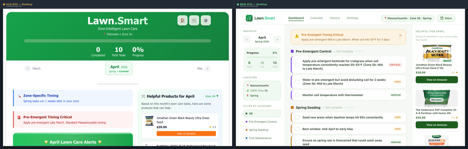
My side project Lawn.Smart is a free PWA that gives gardeners a monthly lawn care checklist tailored to their USDA hardiness zone and state. The functionality was solid — zone-intelligent task data, priority sorting, Amazon product recommendations, monthly notes — but the UI told the story of someone who knew what they wanted to build and far less about how it should look.
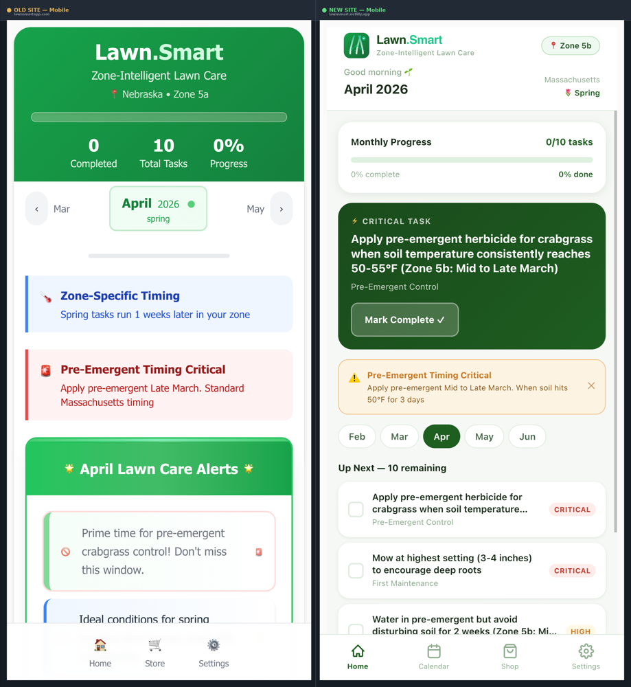
The original design leaned heavily into a dark theme. The body was a deep near-black (#12121e), the header was a large green banner taking up roughly the top 30% of the viewport, and navigation consisted of three emoji icon buttons (🏠🛒⚙️) tucked into the corner. Alert cards used heavy saturated colors — dark reds, dark navies, dark greens — that looked striking in isolation but created visual fatigue at scale. Product recommendations were rendered in Amazon's orange, which matched Amazon's brand perfectly and clashed with everything else. On mobile, the desktop layout simply stacked into a single column, pushing products far below the fold.
It worked. Users could navigate it. But scoring it honestly — which is exactly what I did as the first step of this redesign — the numbers told a clear story:
| Dimension | v1 Score | v2 Score |
|---|---|---|
| Visual Design | 6 / 10 | 9.5 / 10 |
| Mobile Experience | 5 / 10 | 9 / 10 |
| Navigation / UX | 5.5 / 10 | 9 / 10 |
| Information Clarity | 6 / 10 | 9 / 10 |
I knew the gaps were there. What I didn't know was how to systematically close them without either hiring a designer or spending weeks learning tools I wasn't fluent in.
Entering Claude Design
When I started experimenting with Claude Design, I was curious but measured in my expectations. The pitch — use AI to rapidly prototype and iterate on visual designs through natural conversation — sounded promising, but I'd heard variations of that before.
What impressed me almost immediately was how low the actual barrier to entry was.
I started by pointing Claude Design at the existing Lawn.Smart site and asking it to review what was there and suggest improvements. I brought in my existing logo, referenced the live site, described specific pain points I'd been aware of for a while — the dark theme feeling oppressive on extended use, the mobile experience feeling like an afterthought, the lack of any real navigation hierarchy. Within a short time I had a mockup canvas I could look at and react to.
That iteration loop — describe a direction, see it rendered, push back, refine — is where Claude Design clicked for me. It's not that different from how I work through a technical problem in conversation. You make a decision, you look at what it produces, you adjust. The difference is that I previously had no real tool for doing this on the design side without either bringing someone else in or spending hours in an application I wasn't fluent in.
Being able to say "the header feels too heavy, can we bring in more whitespace, shift to a lighter palette, and make the navigation persistent" and see that reflected in a canvas within seconds changed the dynamic completely.
What the Redesign Actually Produced
The changes between v1 and v2 are substantial enough that the two versions feel like different products.
On desktop, the dark full-width layout was replaced with a three-column structure: a 220px left sidebar for navigation and context (month navigation, progress card, location, category filter), a main content panel for tasks, and a right panel for seasonal product recommendations. The top navigation became a proper tab bar — Dashboard, Calendar, History, Settings — with a location chip showing zone and season. Amazon's orange buttons were replaced with dark green ones consistent with the brand. Alert cards shifted from harsh dark-on-dark styling to a soft amber banner (#fffbeb background, #fcd34d border) that communicates urgency without being alarming.
On mobile, the change was more fundamental. The old approach was a desktop layout stacked vertically — the most common mobile-adaptation mistake. The new version is a purpose-built mobile layout that doesn't share DNA with the desktop version at all. A compact header, a pinned Critical Task hero card above the fold, a month pill strip for fast navigation, and a proper four-tab bottom navigation with SVG icons instead of emoji. The app now installs as a full PWA with home screen support. Time-aware greetings ("Good evening 🌙") and contextual location display (zone, season with emoji) make the experience feel immediately personal.
Several features were also added that didn't exist at all in v1: a Calendar view with task dot indicators, a History view for tracking yearly progress, a monthly notes journal, and a category filter in the sidebar.
What I Learned: Design Tokens
This is the part I didn't expect — the process of working through a redesign with Claude Design taught me things I hadn't previously had a practical reason to learn.
The most significant of these was design tokens.
The old Lawn.Smart codebase used colors the way most developer-built UIs do: inline hex values scattered across components, a Tailwind class here, a hardcoded #2e8b57 there, with no real system connecting them. If I wanted to change the primary green, I'd be grepping through files. If I needed to add a new priority level, I'd be making it up as I went.
The redesign introduced a proper token system. Every color has a semantic name and purpose:
const T = {
  green800:  '#1a4a1c',   // darkest text, headings
  green700:  '#1e5e20',   // primary buttons, active states, progress fills
  green600:  '#2a7a2d',   // secondary accents, checkmarks
  green50:   '#f0f9f1',   // light green card backgrounds
  teal:      '#1ec98a',   // ".Smart" brand accent — text only
  amber:     '#c8761a',   // high priority, alerts
  amberLight:'#fef3e2',   // alert card backgrounds
  bg:        '#f5f8f5',   // app background
  white:     '#ffffff',   // card surfaces
  text:      '#1a2e1b',   // primary body text
  textLight: '#8aaa8c',   // tertiary text, labels
};
Priority levels each have a defined foreground color, background color, and label — so a Critical task always means red (#c0392b) on light red (#fdecea), everywhere in the app, consistently. Category colors follow the same pattern. Alert colors too. The system is semantic: you're not picking #fdecea because it looks nice, you're using critical.bg because that's what critical state looks like in this product.
Working with a token system also made the collaboration with Claude Code dramatically more coherent. When the design specified a color, it had a name. When the implementation needed to match, there was a source of truth to reference. It sounds like basic discipline — and it is — but I'd been building UIs for years without it.
The Claude Code Handoff
The feature I was most curious about was the handoff from Claude Design to Claude Code, and it turned out to be genuinely impressive.
Once I had designs I was satisfied with, the handoff allowed me to take that work directly into a coding context and begin implementing for real. Not describing the design to a different tool, not starting from scratch with a screenshot as reference — working from the actual design artifact.
I'll be honest: it wasn't entirely frictionless. There was time spent troubleshooting layout details, tracking down subtle rendering differences between the canvas and the live component, and adjusting things that translated slightly differently than expected. The gap between a prototype and a production component is real and no handoff process eliminates it entirely.
But the time saved compared to translating a design by hand was significant. And what I think matters more than the current state of the feature is what it represents architecturally: agents working across domains in sequence, with context preserved between steps. Design → Code as a continuous workflow rather than a context switch is a genuinely new capability, and it's early. The trajectory is what's exciting.
What's Next
The v2 launch of Lawn.Smart is live. The comparison report I put together before launch confirmed that the redesign closed virtually every gap the original had — mobile experience, visual hierarchy, information architecture, navigation, component consistency.
I have ideas for future projects where I'd use Claude Design from the start rather than as a retrofit. Knowing that I can move from concept to working prototype to implemented product with this kind of tooling — without needing to become a designer overnight — opens up work I'd have previously scoped out of or handed off.
For someone whose creativity has mostly lived in the architecture and systems layer, having a credible path into the visual design side of a project is genuinely new territory. My father would probably still find something to critique. But I think even he'd appreciate that the tools are catching up.
If you're a developer who has historically depended on simple layouts and framework defaults to carry your UI, I'd encourage you to spend a few hours with Claude Design. The ramp is shorter than you'd expect, and the things you learn along the way — like why a well-structured design token system is worth the fifteen minutes it takes to set up — will outlast the specific project you're working on.
Lawn.Smart is free and available at lawnsmartapp.com. No account required — just your zip code and a willingness to actually do the spring aeration you've been putting off.